

Two websites can sell exactly the same product at exactly the same price and still achieve completely different results. The difference is often not the product itself, but how clearly the website presents the offer, communicates value and guides the customer towards making a purchase.
In this comparison, both pages sell Nutrijex Energy Oral Strips for €29.99. However, Version A gives the visitor clear product benefits, reviews, bundle savings and a strong call-to-action. Version B provides the basic information, but gives the customer fewer reasons to trust the store, purchase immediately or choose a larger order.
A strong product page should answer the customer’s main questions quickly: What does the product do? Why should I trust this company? Which option offers the best value? What should I do next? The easier these questions are to answer, the easier it becomes for the visitor to make a decision.
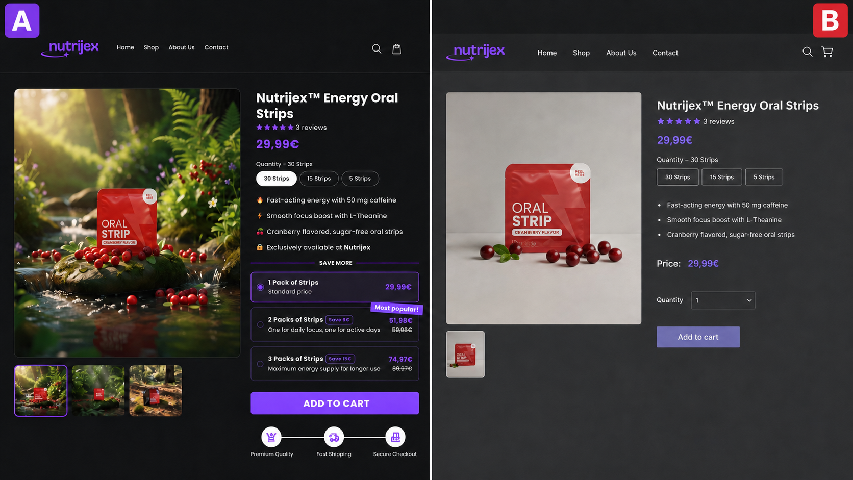
Version A is more effective because it makes the buying decision easier. The customer can immediately understand the main benefits, compare different quantities and clearly see how much they save when purchasing more than one pack.
Instead of offering only one standard option, the page gives the visitor three choices:
- One pack at the standard price
- Two packs with an €8 saving
- Three packs with a €15 saving
This is a clear buying incentive. It gives the customer a real reason to consider purchasing more, while also increasing the potential value of each order.
The “Most Popular” label makes the decision even simpler by highlighting one option for customers who are unsure which package to choose. Reviews, product benefits, secure checkout information and a visible Add to Cart button also help build trust and reduce hesitation.
Version B still includes the essential information, such as the product image, price, quantity selector and purchase button. However, it does not strongly explain why the product is worth buying, why the store should be trusted or why purchasing several packs offers better value.
A professional website should do more than simply look attractive. It should communicate value, remove doubts and guide visitors towards taking action. Even relatively small improvements—such as clearer benefits, stronger images, better pricing options and a more visible call-to-action—can make a noticeable difference to enquiries and sales.
The key difference is how much work each page does for the customer. Version A organises the information, highlights the best-value option and removes uncertainty before the visitor reaches checkout. Version B leaves most of that decision-making to the customer.
This same principle applies to service websites too. Clear pricing, visible benefits, customer reviews and a strong contact button can determine whether a visitor sends an enquiry or simply leaves. A well-designed website should make the decision feel simple, not confusing.
MP Development creates professional websites designed to do more than look good. We build pages that help businesses communicate their value, gain customer trust and generate more enquiries and sales online.